 Ok,
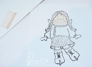
Ok, today I'm going to cover how I color clothing on my Magnolia image "Ice Skating Tilda". Of course you can apply this lesson to any object that you might want to color, I'm doing clothes this time. The picture above is of my well-worn
Copic chart (from Sharon Harnist) that I printed onto my PTI cs and then filled in; and the patterned paper I chose to use. Whenever I color my images I always pick out my dp first (this is Imaginisce's "Snowy Jo" line and Doodlebug's glitter cs)--then I use my chart to pick out my Copic colors. My rule of thumb is that I pick 3-4 colors to use for each part of my image. I then take those colors and make stripes onto scrap cs to make sure they blend & look well together. I really try to pick my colors so they have a strong contrast to one another but are in the same color family. I've found that when I use colors that are too similar I don't get the effect that I want. Of course this is "my" personal preference--you'll pick your colors for your own preference. I'm just sharing with you what I do and like--in no way is anything I say in these tutorials hardened rules or the "only" way to color with Copics. You really have to use them by trial and error to figure out what works for you.

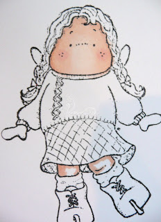
I chose 4 colors to use on her sweater (E07 Light Mahoghany, R32 Peach, R20 Blush,R00Pinkish White). Again I started w/ my darkest color E07 and colored the shadowed areas and edges of her sweater. Remember my light source/sunlight is shining down towards her, so the center of her sweater and skirt will be lighter in the middle.

Then I took my next darkest color R32 and colored over the E07 working out towards the center a bit. Remember to pay extra attention to the edges of the previous color--really saturate your paper each time and work in small circles over the edges really good to blend.

I'm using R20 now to work over what I have just colored and going towards the center just a bit more, making sure to blend real good. I follow up with my lightest color R00 to color in the center.

In this picture you can see the difference now that I have taken my lightest marker R00 and just colored and blended over the entire image. The last picture you could see definite lines between the colors--now the edges are softened and blended together more. You might want your image to be blended even more, but I like to have some sharper contrast on my clothing.

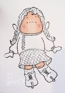
Onto Tilda's skirt--I chose BG45 Nile Blue, B00 Frost Blue, and BG000 Pale Aqua. Again, using my darkest color first BG45 I color the edges/shadowy areas of her skirt. I colored the underside of her skirt more than once w/ this color to make it a little darker because this area would be very shadowed.

Using B00 I color over what I just did spreading out towards the middle, making sure to leave the center (highlighted area) alone.

Then taking my BG000 (my lightest color), I color over the entire skirt area, really working the marker into the paper to saturate and blend those lines away. **Just a side note--when you're really saturating your paper this way, make sure to have something underneath. I use computer paper on top of my
Scor-Mat so if the color comes thru the paper, it will not make a mess of anything.**
I color her mittens in the same way, using the same colors and add some color to the stitching of her sweater. Then taking my white Ranger Inkssentials pen I highlight a few places on her sweater. I also wanted to add some small white dots on her skirt for some extra pattern.
Alrighty, I hope you enjoyed this tutorial today. I use these steps to color all of my images whether they are people or objects. The only change that I make is where I want my light/sun to come from--just depends on my mood or preference that day.
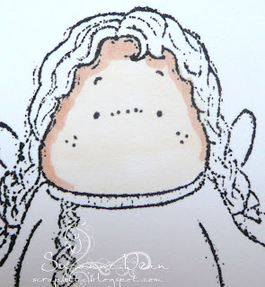
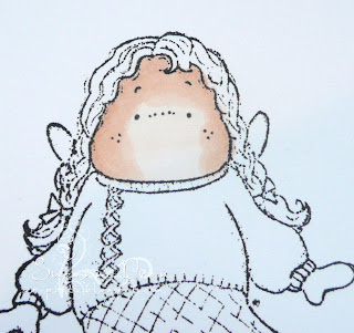
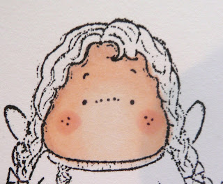
Tomorrow I will do one more tutorial for ya. I will go over what the colorless blender is and how I use it and hair colors, and the finished image and card. If you want more detailed information or different techniques w/ your Copics, make sure to visit the Copic Guru, Marianne over on her
blog--she's the "real" expert, I just aspire to be as good :)
Until then...
Suzanne**If you are interested in ordering this Magnolia image or any others you can contact Diana Crick directly at
magnolia.us@shaw.ca . Her webshop should be up and running real soon--can't wait!!


