Ok, here we go. I just want it to be known that I am by no means a Copic expert. I am only showing you how I color with my Copics--this works for me, but may not work for you. I am not trained in Copics but I do have an art background which helps me alot. You can of course use any colors, I'm just showing you how I do it. Today I'm focusing on faces/flesh--I don't want to overwhelm you w/ a super long blog and instructions. Tomorrow I will cover clothing and how I match up my Copics and pick colors.
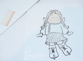
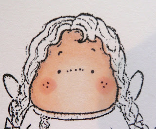
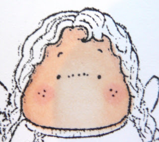
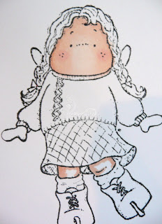
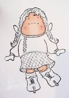
The steps below are numbered per picture above (I have yet to figure out how to not get my pics to post only at the top--if you have any advice on that, tell me please). I first stamp my image with a Copic compatible ink--I use either Memento or Ranger Adirondack inkpads and my paper is always Paper Trey Ink white cs--great for blending w/Copics. This is "Ice-Skating Tilda" by Magnolia. I used these 3 Copic colors for flesh (E000 Pale Fruit Pink, E11 Bareley Beige, E00 Skin White), R20 Blush for the cheeks and my Ranger Inkssentials pen for white highlights.
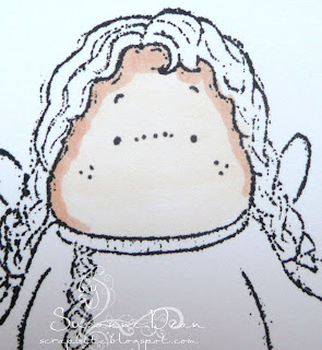
1) I first use E000 to go over the face just once (I'm not worried about streaks right now, I have more layers to do) for a "base" coat.
2) Then I use my E11 to go around the edges of the face or where the face would be shadowed. This depends on where you want your "light source/sun" to be. I want my figure to have sun shining towards her so that the middle of the entire image will be lighter than the sides.
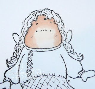
3) I then take my E00 and working around the edges of the face (not the middle) I color in circles making sure to blend into my last color and over it (always go over your darker color w/ your lighter color when blending). If you saturate your paper with color and work in small circles over the darker color you will be able to make your lines disappear.
4) I then take my lightest color again E000 and work over the entire face until all the colors are blended to "my" satisfaction. I try not to over color the face, so I usually only go over it once or twice just to blend--I don't want my face too peachy or dark.
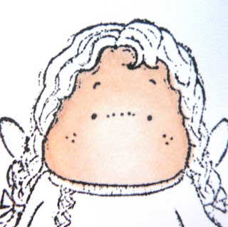
5) I use R20 for the cheek color. I color a small circle on the cheek area just once.
6) I then get out my E000 again to go over the cheeks and around towards the edges to blend in to the face--kinda like makeup; you don't want the cheeks to be just round, dark circles on the face, so you blend them in. Usually you should only have to work over the cheeks once or twice to blend. Are you still w/ me? See in the picture how they blend better into the face now.
7) I did the same technique for her legs, using darker colors (E00 & E11) at the edges where they would be shadowed.
8) I then used the E000 to go over the entire leg, working in small circles to blend the colors together, making sure the middle of the legs are lighter. Remember the best way to know if you're coloring/blending enough is to turn your image over--you should have lots of ink actually coming thru the paper, this means its well saturated which makes blending easier.
I use my Ranger Inkssentials pen to highlight areas on the face and legs. This is totally up to you how you highlight--I like to just add one dot to the cheeks (some like more) and I added some to the rounder part of her knees too. Highlighting is a personal preference--I use it to highlight areas that would bend (knees, elbows and such) or to highlight a shadow in clothing (more on that tomorrow).
I will post a card later today for those who'd like to see some "finished" eye candy--lol. Tomorrow I will work on the clothing for this image, to show you more shading, how I pick my colors and etc. Hope you liked the tutorial--I'd love to hear feedback on it (was I too long winded, not detailed enough & so on) or any other questions you might have.
Until then...
Suzanne
PS--If you'd like to buy this Magnolia image or others contact Diana Crick at magnolia.us@shaw.ca for ordering info.
fabulous tutorial Suzanne,
ReplyDeletewell done...hugs Rachxx
Hi Suzanne - First let me say that your blog is one of my favorites to visit and one reason is that I think your coloring is amazing. Love your tutorial! I used to have the same problem as you with the pictures all being at the top of my blog but I just recently learned how to fix that. Email me if you would like me to explain it to you, it is really easy!
ReplyDeletewhatup1111@cox.net
Terri
Hi Suzanne,
ReplyDeleteYour tutorial is great and so helpful, thank you so much for all the information. Your coloring is just amazing. Can't wait for tomorrow's tutorial :)
Christine :)
Hi Suzanne...Loved the tutorial, the only way you could have made it better would be to come to my house and teach me. :) I can't wait to get more Copics and give this a try.
ReplyDeleteKathy Billings
Eggdcr8tr@satx.rr.com
Hi Suzanne,
ReplyDeleteYour tutorial is really helpful. I know part of my issue is that I need to get Copics in the same family number range. Thanks! Deb
Hi Suzanne, what beautiful coloring! Thanks for the tutorial! I love coming here to see what you have created! Thanks for your inspiration! I have an awrad for you on my blog! Have a great day!!
ReplyDeleteI love your stuff! Thanks for sharing how you use your copics.
ReplyDeleteSuzanne,
ReplyDeleteThanks so much for taking the time to do this...What helpful information you give...Your cards always come out really nice...TFS
Kristina
hey, I am just catching up on my blurfing after vacation. Love the tutorials and look forward to more. As for your pics- you can move them around or put up pic 1 and write your steps, then put up pic 2 and put on steps. If you need more detail let me know. Heidi
ReplyDeletea wonderful tutorial thank you
ReplyDeleteHi!
ReplyDeleteGreat and useful tutorial!
What I do to get the pictures at the correct place...is when they are at the top, is right click on them, cut and then go to the place in my tekst I want them to be, right click again and paste. For me this works, I hope you understand it!
Thanks for the tutorial...I just bought some copics so I need all the help I can get:)
ReplyDelete